Systems
ULK Design System
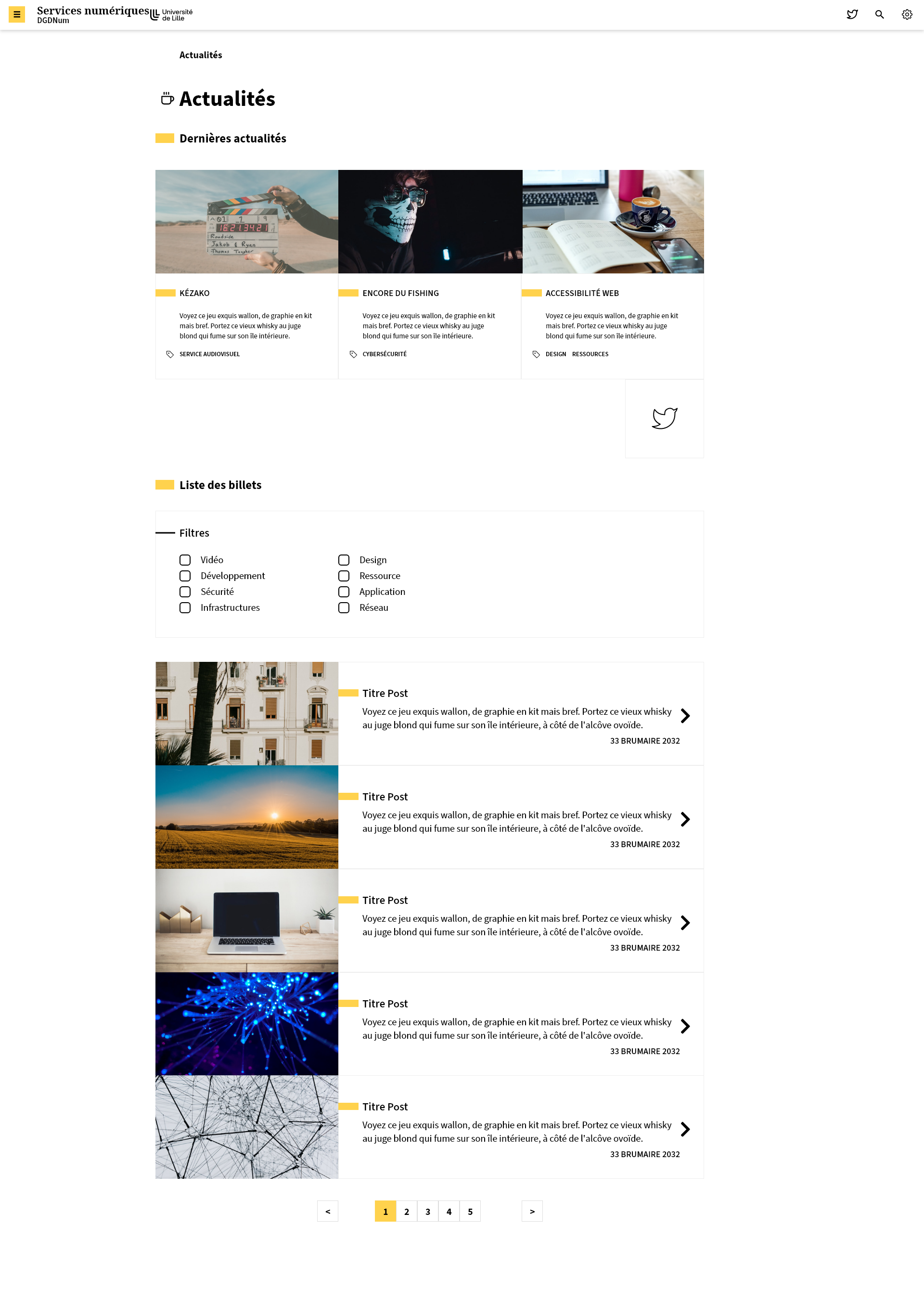
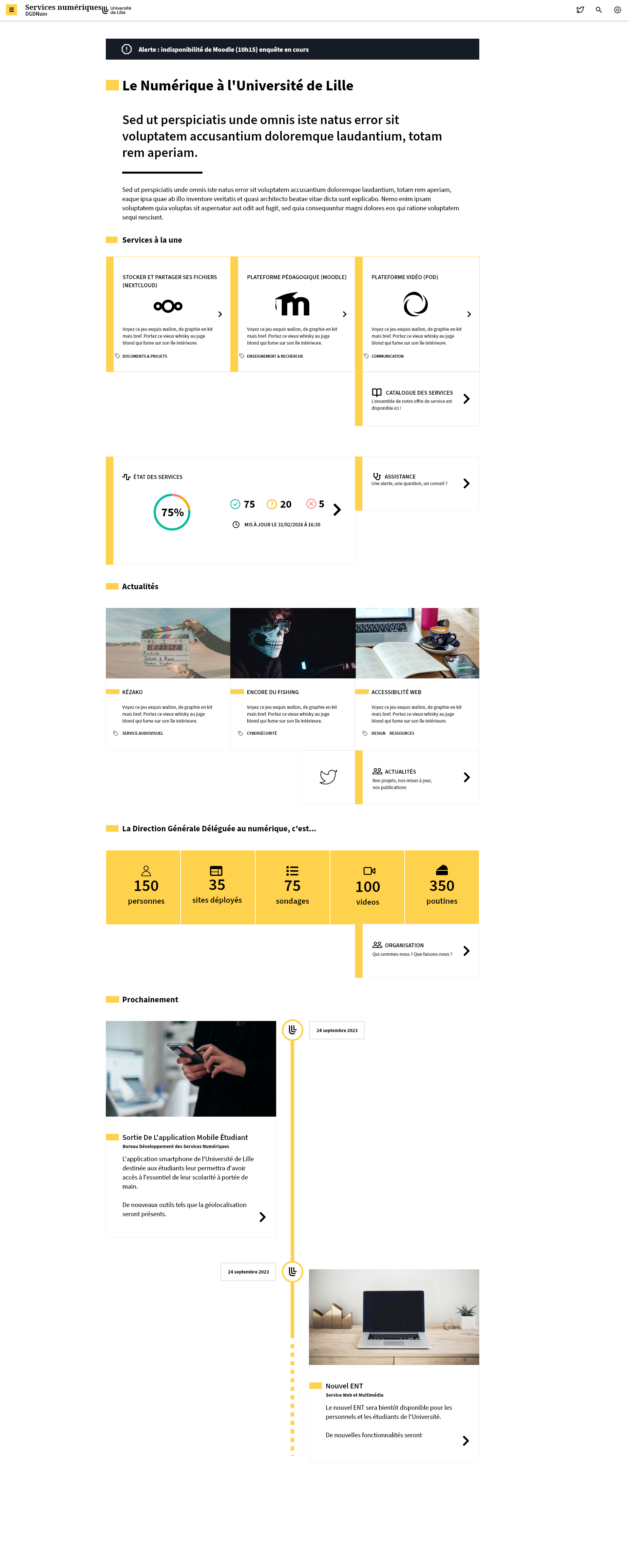
ActiveThe University of Lille's design system, built to unify visual style across dozens of Typo3-based websites, reduce redundant CSS, and offer accessible, maintainable components for long-term use.
- Domain
- Design system Components Accessibility
- Tools
- CSS variables BEM Typo3 Bootstrap JS VS Code Git
- Timeline
- Foundational work (v1 & v2) started in 2022. Version 3 currently in progress with a specialist colleague.
Context
The need came from the platform management team, who were struggling to maintain visual consistency across several hundred sites spread across multiple Typo3 instances (faculties, training/research/events, laboratories, services), and from the communications department who wanted the print identity to be properly reflected on the web. Each instance has a template, deployed to the relevant sites and then customised to the needs of webmasters. Previously, these customisations accumulated without a common framework, with overrides that sometimes conflicted and muddied the overall visual consistency.
ULK went through three iterations. The idea of centralising the structure came from a suggestion, which my department head then took on and pushed concretely within the team. Versions 1 and 2 — the BEM nomenclature and overall logic — were built from there with available means, with v2 already marking a real leap in quality over v1. Version 3 began when a colleague specialising in design systems joined the team: she took over that structure and significantly refined it, adding a token layer and a level of technical depth suited to the project's growing scope.
Structure & logic
- BEM nomenclature:
ulk-s-for structure,ulk-c-for components,ulk-o-for objects, among other prefixes depending on element type - CSS variables for colors, fonts, and spacing, injected centrally with minimal per-instance overrides
- Atomic utility classes (u- prefix) for one-off, punctual styling outside the main BEM structure
- Accessible JS components based on Bootstrap patterns
Accessibility features
- Color system designed with WCAG contrast in mind
- Optional font switch: Dyslexia, Luciole
- Dark mode and theme toggling
- Consistent spacing and typographic scale
- Responsive grid and components
Standards
- WCAG 2.1 AA compliance target
- French RGAA requirements
- Screen reader compatible markup when paired with proper semantic HTML
Collaboration & status
- Versions 1 and 2 developed with my department head, on foundational decisions
- Version 3 in progress, led by a colleague specialising in design systems, with token architecture and technical refinement
- System active, deployed across several institutional sites